I never know what other people don’t see. Cathleen didn’t know that BloodhoundBlog and DistinctivePhoenix.com are based on the same WordPress template. Likewise for Real Estate Weblogging 101 and The Phoenix Real Estate Technology Exchange. She could see the differences, but not the similarities, not until I noodged her to look for them. Yesterday, I posted on a program that works out of an array, and it was only after I had hit publish that it occurred to me that I hadn’t defined what an array is. My expectation is that these posts, professions of enthusiasm notwithstanding, are progenitors of a profound megoism, but, if anyone craves a deeper understanding of arrays, email me.
Meanwhile, take a look at this image:
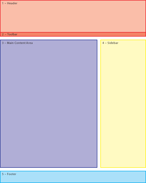
This is a highly-stylized rendition of what Easter will look like in a world where pi equals four. No, that’s not right. It’s a map to very common sort of web page layout in the world of Cascading Style Sheets. If we ignore the differences and focus only on the similarities, that stylized page looks like… this page. And your own web pages, very probably, and dozens or hundreds of other pages that you’ve seen. There can be superficial differences — the sidebar can be on the left, or there can be two sidebars, or the two sidebars can straddle the main content area — but what we’re looking at, at bottom, is the essence of a text-oriented web page in the CSS world.
Why think about this?
(Oh, man! Don’t get me started! I’m going to think about it, with you or without you, because I want for there to be at least one space in the void where it’s permissible to have a brain…)
Wait, that’s not why. Here’s why: Because if we think about how pages are engineered, we can engineer them.
Like this: If we see a page like that on a web site — a page like this one — we know that it’s just one of tens or hundreds or thousands of pages, all of which will look pretty much the same.
Here’s an important question: When one of those pages is different from another, where will the differences occur?
The header will almost always be static, although the toolbar might do flashy or even intelligent things as a reflection of contemporaneous mousing or past clicks. The footer will be static, almost without exception. We do stunts in our sidebar, but the content itself is constant — although later on I’ll talk about doing dynamic changes in the sidebar.
The real action is all in the main content area, isn’t it? Everything else is like the support staff in the doctor’s office, but that blue rectangle is the doctor. What I want to talk about — and we’ll take it slow, I promise — is how to engineer a workflow so that you can rapidly and reliably produce professional-looking web pages and full-blown web sites. A couple of days ago, I talked about how we do this with software. Here I want to talk about the HTML and CSS (and, yes, PHP) principles behind that software, so that you can do work like this on your own.
How do I know this will work? What I’m going to teach you is how I used to do web pages before we built Slide Show Marge.
For now: You need to decide what appearance you want the pages and sites you’ll be building to have. It could be your current static web site or your current weblog or some other design, but you need to settle on something. The principles I’m going to teach you will work on any standing web design — stipulating that it’s done in true HTML/CSS — but you can’t dance with everybody. Pick a partner — and then figure out where the blue rectangle would be on your chosen design. When next we take this up, I’ll talk about how to build pages that let you concentrate on the blue rectangle and let the other parts of the page take care of themselves.
Getting in touch with your inner geek:
- Apprehending Realtor 2.0: Seven essential skills of the 21st century real estate agent…
- How to make fast, flexible web pages…
- Catch your kid doing something right: Our son Cameron and the upgrade path of SlideShowMarge
- How to make Google your weblog’s best friend…
- Speaking in tongues: Presentable PHP in WordPress
- Speaking in tongues: Dynamically updated lists of links in PHP
- Speaking in tongues just for Cheryl Johnson: Building content-rich custom web sites in PHP
- Speaking in tongues for Morgan Brown: A quick and dirty contributors’ blogroll
- Speaking in tongues: A step-by-step guide to speaking in web sites
Want more? Real Estate Weblogging 101 will speak to your inner geek. And if you want even more than that, be sure to join us for BloodhoundBlog Unchained.
Technorati Tags: blogging, real estate, real estate marketing, real estate training, technology
Brian Brady says:
Easter when pi=4? Where do you come up with this stuff?
“I’ll talk about how to build pages that let you concentrate on the blue rectangle and let the other parts of the page take care of themselves. ”
Warning: this question comes from a converted Luddite. Does that mean you’ll be showing how to create a templated design with the footer as the variable?
January 5, 2008 — 7:21 am
Teri Lussier says:
I’m seeing some English here. 😉
You are starting from the very very beginning- assuming no experience, only the desire to figure this out? Since you are drawing pictures, I just might be able to follow along.
January 5, 2008 — 10:29 am
Greg Swann says:
> Does that mean you’ll be showing how to create a templated design with the footer as the variable?
Blue, not cyan. What we’re going to do is build tools to make it easier to deal with that Main Content Area on web pages and web sites by pushing everything that always stays the same out of the way.
January 5, 2008 — 10:32 am
CJ, Broker in NELA, CA says:
A world where pi=4 and all my income is rounded up to the nearest K (and all expenses rounded down). I could dig that.
January 5, 2008 — 11:23 am
Allen Butler says:
I want a web page like Russel’s. His isn’t square!
January 5, 2008 — 10:20 pm
Greg Swann says:
Here’s how a Russell Shaw page fits our design schema:
The headline and photo in the sidebar change, but that’s an easy variation to deal with in PHP.
Thanks for bringing this up. Nothing like a real-world example to illustrate an idea.
January 5, 2008 — 11:42 pm